Back in December, we released the first stage of our new design look & feel. Today, we’re happy to announce this new look for the Suppliers portion of Aligni. But this update is more than just a pretty façade.
New Look
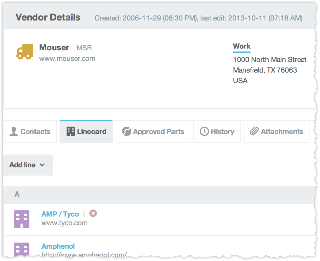
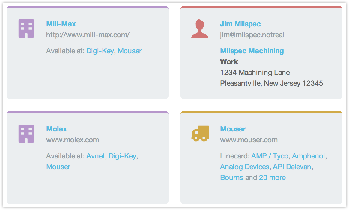
For starters, we’ve updated the overall page design to be cleaner, more consistent, and easier on the eyes. Now you can display supplier information in a list format or three-across as cards. Manufacturers, Vendors, Contacts, and Customers (new!) are differentiated by icon and color.

Summary information such as email, phone, address, and distribution is available at a glance and details are only a click away.
Better Organization
Supplier detail information is now better organized into tabs, making it easier to find the information you’re after and also bringing some items (like History) into clearer view.

Attachments – Drag and Drop
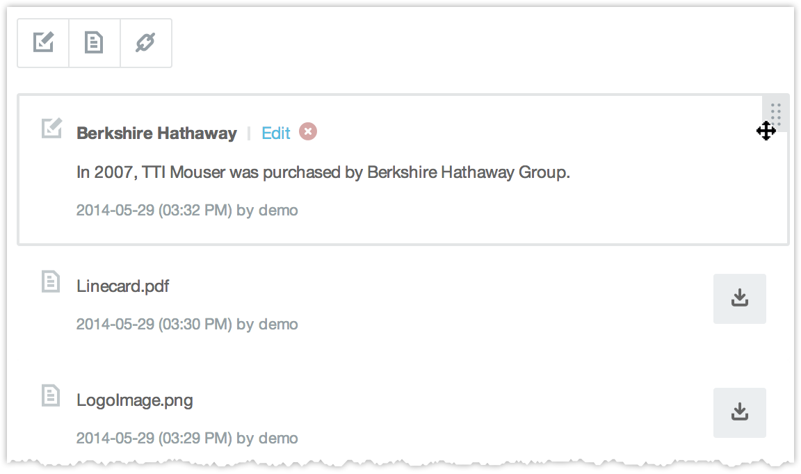
Modern browsers now support file drag and drop and we love it! Now, when attaching files to a supplier, you can simply drag and drop the file from your desktop to the browser. It makes the Aligni interface feel much more like a native desktop application.

We’ve also added drag-and-drop reordering of attachments to help you prioritize the information better.
Customers (and more)

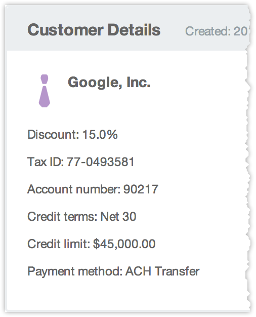
Finally, we’ve added Customers to the bunch. While not technically a supplier, customers fit the genre of relationships that we’re trying to foster with the “Suppliers” section. You can keep important details about your customers here such as credit approvals, notes, terms & conditions, etc.
Multiple Addresses
Finally we reorganized the addresses and phone numbers a bit. You can now store multiple addresses and phone numbers with any supplier or customer and attach a descriptive label to them for reference.
Start your 30-day free trial
Helping You Make Great Things…Better.

